♣ ♠ ♣ ♠ ♣ ♠ ♣ ♠

♣ ♠ ♣ ♠ ♣ ♠ ♣ ♠

-

Michelle Brien.

Year 13.
A2 Media.
Post Podutction.


Thursday, 6 January 2011

Evaluation.

What have you learned from your audience feedback?


When we making our questionnaire we decided to make most of the questions open ended this would benefit us because we could get opinions from the audience feedback, this allowed us to make some improvements. This also allowed us to get back some positive feedback, it was rewarding and fulfilling to receive some praise about our music video.
We gave our questionnaire to our specific target audience late teenagers around 18 years old, both female and male, the majority of our responses where female however we knew this was predictable as most females would sympathise with our main character and the main story line.
We mostly worried about the story line of our video and that our viewers wouldn't understand it clearly, we did not want to make the story too confusing but it was hard doing this with out revealing the twist to the viewers. Results from the questionnaire confirmed us that everything was fine and that people understood, we did have some opinions to help us which was to show the flashbacks off the ex which would help illustrate the twist and make it more clear. Our audience liked the idea of the twist, and accepting their opinions and feedback it helped us make our music video better.
We also asked questions about the music and the speed of our clips, we was worried about some of our clips being too long and that the music would make it boring for our viewers. We was reassured that our clips and timing of the music worked perfectly from our audience one feedback wrote 'the timing of the music worked perfectly and the quick shots made it more exciting', this is exactly how we wanted to portray our music video and how we wanted it too be seen. By receiving positive feedback like this it helped us feel more relaxed about most of our work.


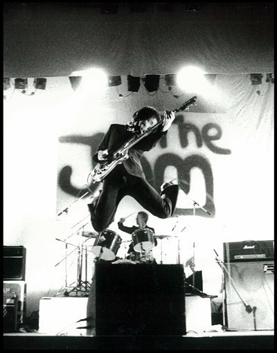
By handing out questionnaires to the viewers it helped us work on our video or things we was not certain off, we learnt to keep it the same and not change anything. Most perspectives of our video we was unsure about but we knew that they were conventional things in drum&bass music videos, our main problem was the drugs we was worried that our audience would get the wrong idea but we did portray them as bad in the video. We had positive feedback from our audience about this particular area. We know that people that attend these drum&bass gigs/festivals are surrounded by this environment, this image is taken from a gig at the famous drum&bass band Prodigy, as you can see in this photo everyone seems to have a 'buzz' about, so we know that this type of audience is who we would be appealing too and who we aim too sell our products too.


We also so had some critical feedback for our video, from our teachers at school, when planning our video out we looked at all the different angles of how we can have our blunt ending of our protagonist killing himself. We was just going to have the build up of our protagonist doing more drugs and drinking, getting more and more into a depressed state. We knew that by doing this people may expect that because of the slip of depression he might actually kill himself, so our teacher gave us some critical feedback to have a 'turning point' therefore the audience would think he was getting better and then the blunt ending of him in the bath after committing suicide. This we think made our video much better and in fact changed how everyone will see this video, as well this helped us promote that the use of drugs and alcohol is bad as we use some camera shots that shows the viewers his vision getting clearer and him as a visible state seems better, this helps us show the audience that drugs and alcohol are bad. The main reason of having the turning point makes the ending seem more delayed and blunt which keeps the audience in suspense and in shock when they see him finally dead.
We also wanted the promo pack to relate to the our music video and keep the same occurring theme throughout it all, we took some constructive feedback from our questionnaire audience when we asked them what would best suit the audience, they agreed that keeping the theme of black and dull colours would be the most appealing. We also received some response about the front page that we should make the text smaller but more bolder so that it stands out from the page. This helped us as it did make the image look better rather than having a big bold and taking it away from the picture. This helped our promo back look more professional and less tacky than what it did before by making the text smaller and changing it too a Gothic text.
Once our promo pieces was done we asked too our target audience 'If you saw these pieces would you buy them?' 15 out of 18 people said yes, which is a high percentage of people liked them, this made us feel positive about our work.


We learnt whilst reading our questionnaire answers that it is important to take on the opinions and use them to help your work, as their feedback is the most constructive and will make our product more appealing to the viewers.
Wednesday, 5 January 2011

Evaluation.

In what ways does your media product use, develop or challenge forms and conventions of real media products?

Before we began to start our own media project we researched into videos in the stereotypical drum&bass music video's, we looked at all the conventions that they used in them, Eg: the drugs, alcohol and parties. We also carried on looking at the other conventions the less popular ones but they still appeared in each video, we looked at this because we knew we could change them to make our video stand out and have an unique selling point, which will be more original to other video's.
We have a typical convention that is normally associated with Drum&Bass genre's, this is the drugs, alcohol and the minor bit of violence that appears in our video. We choose to keep this conventions the same because they are so commonly seen in these types of videos. At the start when I analysed my perfect target audience, I mentioned that most teenagers this age would be going out to parties, gigs and festivals, stereotypically drugs, alcohol and violence are involved in these environments, by using these conventions it helps us relate to the audience. All though, by using these conventions we do not promote the use alcohol and drugs, we show this by the protagonist sinking into deep depression and the end result is not well, we do this on purpose to show the negative view of drugs rather than the stereotypical 'fun' side that can be seen with drugs, we got this idea when analysing out main video, Let You Go - Chase & Status.


This photo is from a drum&bass music video, this shows straight away the bad effects of drinking alcohol as you can clearly see the depression on his face and the positioning of his body. This is what we try to imply when doing our video that the use of alcohol and drugs is bad and not a sensible road to take.
Most video's of the drum&bass genre also have the quick movement and high action, we also tried to copy the un-steady camera angles, by doing this hand held, by doing this it shows both the edge-y and hectic style and also we done this mostly with our point of view shots so we could also say that this is the bad view of taking drugs and drinking alot of alcohol.
Another common convention that is seen in drum&bass videos is that the band do not appear in the actual video, they normally have a set story that follows the lyrics of the song, we followed this convention as well by not having any sign of a band in our video, also we had no characters to mime the lyrics of the band. By following this convention we thought it would keep the audience more intrigued with the story and the music.

Our main inspiration came from one of our first minor analysis 'Prodigy - Smack my bitch up'. We liked the whole one shot throughout the whole video, the point of view shot made it more personal and intriguing to the audience, because of Prodigy being a well known band we expect these frantic and crazy video's from them, this is why this types of video works well for them. The camera the whole time is very un-steady and hectic, this is where we got the idea for having this angle of camera's. As we follow the protagonist of this story around we watch the person get drunk and do drugs this continues through a whole night, the main character does stupid things with touching and trying it with various woman and actually having sex with a woman at the end of the night, we the audience straight away come to the assumption that it is a man to be the protagonist, until the twist is revealed in the morning, that the protagonist is a woman.


Having a twist like this appealed to us. This is when we decided to challenge the conventions, by having a twist similar to this video but more serious. We looked at various drum&bass videos and there is always a key interest of romance involved, we try to focus our ideas around a relationship. The conventions of a stereotypical romance in a film is having the girlfriend/boyfriend leave them, and they begin the lonely story. This photo is from the video - Chase & Status - End Credits (Feat. Plan B), this demonstrates a typical romance drum&bass video, the couple on the left side of the photo and then the lonely story begins on the right side. This is what we want to demonstrate but challenge the convention with our very own twist at the end which is that our protagonist is in a homosexual relationship.
Another way we challenged conventions was that normally in pendulums video they do not set a story for the video, they have irrelevant videos to the lyrics, in the actual pendulum video for 'Water Colour', it is mostly wide shots of the band playing to a crowd and water is sprayed and fired everywhere. We challenged the convention by having a story line with our very own twist. We choose to do this because we knew trying to follow the conventions would be very hard to conceive and instruct, also opting with having a story line makes our video more original and modern, especially with our twist.
The main convention that we have changed challenged in our video is our theme, our video is mostly centred around the theme of love, and for a drum&bass video this normally does not happen. We slipped in the normal conventions of drugs, alcohol and mild violence to keep our audience involved and interested and not to change to much. We kept the audience interested by leading the whole story over the course of the day, with the usual items that are involved in the drum&bass video we kept the audience involved by always having them involved and sympathising with the protagonist, we keep the viewers on suspense with the quick and hectic shots also the two attempts of near death, that leads to a shocking blunt end. Most conventional drum&bass videos have a dark and gloomy edge to them, we kept to this convention but had our main twist of the main character being in a homosexual relationship, this challenges all conventions but also keeps the video modern and up to date and with the times which is accepted in this generation.

Evaluation.

How effective is the combination of your main product and ancillary texts?


To create a more professional and modern look on our music video and promo packs we wanted to have a clear theme running, this keeps a clear connection between the prices of our promo packs and the price of our music video, the main way I think we achieved this was by keeping the same colour theme through out everything, besides the front cover in some way. We stuck to black and dull colour except a part off the front cover from a first look the cover seems bright, which is what we want it draws you in at a first look but when taken a closer look at the front cover their is a clear edge of darkness from the burnt outside and the shadows in the picture, also because of the dull shadows the bright colours stand out, this falls perfectly into our perfect into a dark and dull theme we have set.
We mainly want to set a different, quirky and modern edge to our advertisement, by doing this we can attract the right attention we want and attract the audience that this style appeals to. When creating our front cover we added a patch border that had look like it had been burnt, by changing the contrast of the main image it created shadows and dark outlines on the features of the front cover. Tilting the title and having the text in Gothic writing also makes it a bit more different, by doing these little easy features it creates a different image straight away, which will attract the target audience we want.
Our promo packs are created to address the teenage audience we want by having our simple and modern promo it works effectively, especially with our promo prices this helps sell the Pendulum, therefore helps sell their music, 'Water Colour'. As we have mentioned at the start of our tasks as a group, we know that this certain target audience do not fuss over big advertisement and big promotion packs, they know about Pendulum as a band and are passionate about their music, this therefore is enough to keep them keen and interested in the band and their music.
Further more we know advertisement plays a big key in this, we do like to reflect the deepness within the music though our advertisement, we wanted to keep the running theme and we still think that our promo pieces are eye catching, we added reviews from professional companies so for anyone who is new to listening to Pendulum all ready have a good on look from our advertisement.
We believe as a group that a key to keeping our main video and ancillary texts similar is too keep a constant theme running through all of the media products we produce, in this circumstances being the dull and dark colours. We make this appear realistic because of the main theme making our products look professional, and using the normal conventions.

Tuesday, 4 January 2011

Evaluation.

How did you use media technologies in the construction and research, planning and evaluation stages?


We used various media technologies to make our products, the main media technology we used was Blogger, we used this technology so that we can keep track of our on progress knowing what left to do it also helps us analyse, plan and construct our final product and finally evaluate it all. Using the blog technology shows that everything is more modern than working on folders, it also makes work more efficient and professional looking, this is the second year of using a blog as we used it the year before in our AS work.


To help aid stages of our analysis we had to look into other video's that are similar to ours we used youtube, youtube is another media technology that was very useful, we was able to watch the video's as many times needed and then post onto our blog by copying the embedded code into a post. I think youtube is the most useful technology we used, it helped us look at wide range of music video's which helped us depth-en our video analysis, the blog was very simple and easy to use and posting videos onto our blog was even easier.

Another simple technology was goggle images, we used this to get photo's of existing CD covers and annotate and analyse them. This helped us a lot as we was able to get some ideas in able to help us create our promo packs and make it that bit more original and quirky. We also used it to access some images that have been print screened so we could help evaluate and compare our images to professional footage.


The main piece of media technology we was using was our camera, tripod and charger now and then. We was taught how to set up the tripod and use the camera basically, we knew were all the USB slots where and batter slot. However we had not actually used it ourself, but was fairly easy to use and set up, as we continued filming are skills with setting up the camera and using it became more efficient. Once we would have finished we would upload our footage to the mac, which we have been using since GCSE, so it was easy and quick to use.


Once the footage was uploaded we would then move it into Premier Pro CS4, this was the main technology we used it allowed us to construct and build our music video. The programming was efficient and brilliant to use. All though most of the time it was frustrating and difficult to use the end results was worth the time that was put in. We was given a basic use of how to use this programme by our teachers, we was taught how to upload, save and move our clips, from now on we had to use it ourselves we found as a group that using this type of programming yourself and figuring things out was the best way in learning. We figured out how to use basic editing by trying and if it was wrong, did not look right or just did not work we would simply undo it.


Without these use of media technologies it would of been extremely difficult to make our final media products which were effective, successful and professional.

Monday, 3 January 2011

Audience Feedback.

When doing our questionnaire we found it best to do a hard copy rather than a blog as we knew we would get a better feedback because not many people use blogs. We handed our questions out to late teenagers 17/18+ both female and male, this helped us get a wider knowledge of what suited other people. The majority of the audience that had got back to use were majority female, this worked out better for us as we knew that females would sympathise more with our main character also the story would appeal more to them.
When handing out the questionnaires our main concern was that the audience would not understand the story, that it might not be clear enough to the audience. It was hard trying to reveal the story bit by bit without giving away the twist, once we had the feedback, our questionnaire audience re-enforced that the story line would be fine and clear to the audience and that it was not that complicate to follow. All though some responses did tell us that we needed to make the part and the end clear for it to work, we needed to add a flashback or more than the photo to tell us that the boy was the ex, we made sure of this by added the flashbacks of the boy 'Alex' at the end as we thought that the was the best idea, and as it was an idea from a viewer it would work more than most ideas we would come up with as a group.
We tried to mix up our questions so that people would give us a view about everything and even some advice, we asked 'Are the drugs/alcohol a good idea to include in this kind of video?'. We asked this because we believe that this was an issue we realised could cause most problems, but because most of our viewers would be 18 and above that they would be sensible enough to know that it was just a video. People responded well to this question as we had hoped, this helped us improve our video by editing well on the parts that involved drugs and aggressiveness when smashing the bottles. the positive feedback included 'The drugs and part violence gives it the edge that is involved in a drum&bass genre' also 'This stuff happens everyday with drugs and alcohol, its good to confront it because its in the environment we live in'. This type of feedback was encouraging for us so we continued with out positive attitude with the drugs and alcohol use in our video.
When we was editing we was worried about the speed of our song because it has so many fast paced and slow paced parts it's hard too keep control with the shot's, we did not want the viewers to be caught up in the fast paced editing and then find the slow parts boring, we asked a question to our audience about this, ''what do you particularly like the most about the music video?'' the responses was good as people said the editing worked well with the timing of the music, one reply said 'the slow parts of the music was the best, the rocky-ness of the camera made it exciting and they seemed deeper and darker than most parts of the video' - This was a good response and what we hoped for, also the way the included the 'dark and deep' bits worked well to our advantage as this was how we wanted our video to be portrayed.
We had good responses to our point of view shots especially the one on the bridge, one response told us 'The shot on the bridge, when looking up to the sky made it different to what most people do, even though it was a long shit and was stable, it still kept me interested'. This was a brilliant feedback as even the long shots did not bore people as we thought they would, it is good to hear that some of our shots our different to most video's, this gives us the sense of individuality which is what we aimed for at the very beginning of our project.

We also asked questions about our promo packs to see how they would come across to our audience. We had good feedback from this also, we asked 'If you see this as a CD pack would it appeal to you to buy it?' - Our responses went well talking about our individual photo's majority of people preferred our front picture, 'the colours are eye catching and the effects on the photo also the type of photo suits Pendulum'. This was a brilliant feedback that was received, as the majority of people liked the front picture we was concerned about the back of the CD cover, until we came across what we think and no is positive feedback. One reply said 'The back cover is amazing, not something you would put with Pendulum but the originality works perfectly to draw in people'. We think that this is very positive feedback as we said at the start of this project we want something different and original. Everyone gave positive feedback about the poster inside including how it is the perfect advert for people to go to one of their concerts as well as lesson to their music.

We had a lot of different responses to our questionnaire all positive, and we are great full for this response we have got.

Magazine Advertisement.


When creating our magazine advertisement we wanted to make it easy and simple and nothing too fancy, so we stuck to the conventional things to do.
We have in big bold letters 'PENDULUM' this straight away attracts the audience and gets their attention of who it. We then put the front cover of our CD as the main image so the audience know what is is about and what were advertising.
At the bottom of the page we have magazine quotes and ratings about our album. All positive of course to promote the band. In the right corner we have a puff like text telling the bands when the CD will be released and available to buy. This is key information and therefore is in a different colour so it stands out and is a main focus for the audience to see.
We then have the same image we used in the middle of our CD and is a very famous photo of Pendulum, so this will draw in the audience attention, across that in a different colour we have 'UK TOUR IN JUNE', this straight away will get attention from the audience. This is added to create publicity and not only help sell their CD but their tour for next year, we are multi-advertising to make Pendulum bigger and well known. This is common amongst Drum&Bass or Rock genre bands to get them promoting everything all at once, so everyone knows what's next for this band.
When first making this advertisement we was going to challenge conventions that Pendulum normally do and make it bright and out their, but then we realised it would make more sense to keep it dull and dark with bright which they normally do because other music advertisement will be having bright colours to attract attention. We kept our advertisement in tune with the same theme of colours we used for our DigiPack, by doing this is makes the whole advertisement process look sophisticated, modern and neat instead of having bright and tacky colours. By having the dull colours it also creates the real pendulum vibe they give out, but when they preform it is the complete opposite. Also by having the simple colour theme the writing will stand out which is a repetitive theme that we used when making the DigiPack, which helps us deliver the message short and sweet to the readers by making it stand out.

Our Final Music Video.


The video starts with a close up of a phone, the phone vibrates a receives a text in perfect timing with the beat of the music. The camera then moves to an extreme close up of the text being opened and the text reading, 'Sorry I can't do this any more' from 'Alex'. We then pan upwards to be introduced to our main character who has just red the text his face shows different emotions of upset and anger, so we assume he has just been dumped. This is where we know that the whole music video will be revolved around our main character. We then have a shot reverse shot of our main character resulting to alcohol, he would take swigs of vodka and then a medium shot of the alcohol slowing decreasing, this emphasizes how much the character is drinking in such a short period of time. We continue these shots for another 6 shots until the alcohol is all gone. We chose to have our main character drinking alcohol so early because it will show his anger and un-happiness caused by the text just received, also alcohol is a convention that is normally associated with drum&bass music videos. We then have a point of view of him looking down on the vodka bottle that he has just dropped, this also shows how much he has drank as he has finished a whole bottle.
We then have wide medium shots of our main character messing up his room by tipping part of his bed, throwing items and throwing his clothes. When editing these shots we had to decrease the speed to make them fit in with the slow pace of the song at the beginning. We then have a close up of our main character ripping the photo up, this photo has a big importance in the video as we see it later on in the video.
We then use medium shot of him leaving a house, this helps makes the video flow and make sense so we know how he gets to one place to another. Also using different transitions help show that time is passing throughout the video quickly.
As our main character is walking along the street he is still reading the same text from earlier in confusion, but is shocked to see his ex with another person, their is obviously tension in the atmosphere. So as our main character passes staring at the couple, they both look over their shoulders making eye contact, we have decreased the speed of this clip as well to show the importance of this part of the video.
As the slow music begins to speed up, we have added quick cut shots of the main character and his actions, this fits in with the music and keeps the audience engaged. Out of fit of anger, the main character goes onto kicking and throwing road signs, this shows the audience how angry he really is, we then switch to a point of view shot of an on coming car, this is done by hand held so it still fits in with the fast paced music with the unsteady and jolt of the camera, this creates excitement for the audience as they do not know what's about to happen, in a last second our main character jumps out of the way to watch the car go past. This shows to the audience how desperate and distraught our character is with his attempt of suicide.
By keeping this whole shot hand-held it keeps the audience intrigued as its as if they are watching it through the characters eyes.
The following sequence start with the lyrics 'Take me out of her' as we have a pan downwards to the protagonist falling onto the floor in weakness, the high camera angle shows the vulnerability and weakness. The protagonist makes a phone call, which is then followed by a mystery character walking around the corner, we use a long shot so the audience can see the full mysterious character, from a stereotypical dress and walk we can see that this character is trouble. We use a shot reverse shot of the protagonist and our new mysterious character talking, the camera is close to show the frustration and anger on their faces this highlights the tension and anger in their conversation. An extreme close up of drugs being swapped from hand to hand is seen, so we now know this character was a drug dealer. After the shot of the swap, we switch to a point of view shot of a white blur that dissolves into a clear point of view shot of drugs lined up, the blur and then sudden clear view shows the effect that drugs and alcohol has taken on the main character.
A new location is introduced by an establishing shot, the following shots are of the protagonist throwing bottles at a wall, we used a special effect to keep the audience interested and highlight the smashing of the bottles by reversing the shot and slowing the duration down, so our character throws the bottle - it smashes - the then bottle reforms like rewinding and he throws it again. We then highlight one and slow the speed down when a bottle smashes against a certain part of the wall with graffiti reading 'Jay is Gay', the audience for the time being will take no notice of this un till later when it relates back. To keep the flow going we have a shot of the protagonist running up a hill from a long distance shot, to then a point of view shot of him looking down whilst standing on top of the tunnel, the camera is still shaking and unsteady this emphasizes the use of drugs and alcohol. The use of this hand held shot makes the audience again see the pressure and distraught from our protagonist considering suicide again. We have an extreme shot of a watch, this is to illustrate time going quickly and that the events have taken place over a whole day. From now on all of our shots are in darkness, this helps creates more confusion from the main character especially the point of view shots with lights that blur and spin, this again highlights the use of drugs and alcohol.
The following section of the video is the fire, we choose to use this bit towards the end because using the fire in pitch black makes it stand out, it also makes the video have the dark and gloomy feel. He burns presents and items that belong to his ex, this emphasizes the lyrics that are playing at this moment of time 'Feed the Fire', we switch to a point of view shot, by using the camera hand held to where he walks towards the fire then falls in front of the burning fire, again this is another near death experience for our main character.
From the previous shot the blurriness zooms out into the clear view of the drugs to which our protagonist wipes away the drugs and throws away alcohol, this is a significant turning point for our character to which we believe he gets better. He pours alcohol into the sink which shows the cleaning phase we us a transition from the running water down the sink to running water coming out of bath taps. This helps keep the video running smoothly. As the audience now knows we are in the bathroom, we have an over shoulder shot of the main character looking into the mirror with a distraught and deppressed look on his face. We see a close up of a phone were out main character forwards the text previously recieved from his ex, saying 'Sorry i can't do this no more', this add suspicion and confusion to the audience as they expected him to be getting better. We have a pan upwards to show the protagonist in the bath, but with blood on his wrists as the pan upwards continues we see him laying their in the bath surrounded by his blood and his other wrist slit. As the audience would be startled to see such a blunt ending, the photo that was ripped earlier by the main character is slowly dropped from his hand, and in slow motion falls to reveal that the ex 'Alex' was in fact the boy from which we saw earlier in the street when our main character had passed them. This reveals that our love couple are a homosexual couple, this challenges the conventions of the typical couple as we see homosexuality to be embraced. We see a flash back of the boy Alex from earlier we also increased the contrast of that shot to make it brighter this clearly shows that its a flashback, we then switch back to the photo laying on the floor to remind the audience that it was the boy from earlier. We switch to a medium shot of our main character whilst zooming out, it ravels that he is still in bath still with slit wrists and has sunk lower in the bath as the blood spreads, and the music slowly dissolves out to a blunt ending.